Here it is guys. This is the responsive redesign I’ve been talking about for a couple months. There is very little code reuse from the previous design. I’ve re-factored or re-wrote pretty much every line of code.
There were two primary focuses with this redesign:
- Fully responsive, mobile first design
- More modern, less heavy design
At the time when Joe and I designed the first iteration of MovieByte, we both really liked it. Event since that short amount of time has gone by the web has changed drastically, design sense has changed a lot, the winds of what looks good has shifted, and most importantly, I have learned a lot about mobile web development. I’ve taken a job as a full time web developer and I no longer felt like this site represented the best of what I had to offer. So it was time to make a change.
Responsive
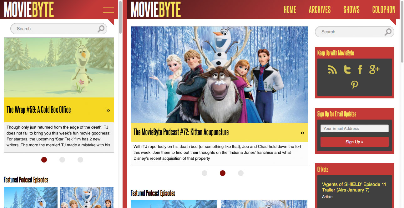
So, what does responsive mean? Well, grab the edge of your browser and start shrinking the window down, go on, I’ll wait. See how everything re-flows and resizes itself to fit? That’s responsive design. This site now looks just as good on an iPhone or Android phone as it does on any desktop browser. Though there are way more devices out there than I have the ability to test with, this site should now look good on just about anything because it adapts to the size of the browser.
Modern
From this vantage point I would describe the previous iteration of MovieByte as a “heavy” design. Though I really enjoyed the look, everything appeared to have a lot of weight to it. It did not respond to browser size, there were some terribly hacky things I did in the code and javascript because I was stupid, and it used a lot of high resolution images instead of pure HTML and CSS. So it was also heavy in the technical sense.
This new design is light. It feels light on it’s feet, it adapts to the browser, it uses almost no design images, instead rendering elements with HTML and CSS, and there are no javascript hacks. The focus is on the content.
Odds and Ends and New Features
The home page has a new layout that focuses on featured content. But all the posts are still there, and if you scroll down you still get a pager like before where you can browse back in time through every single post.
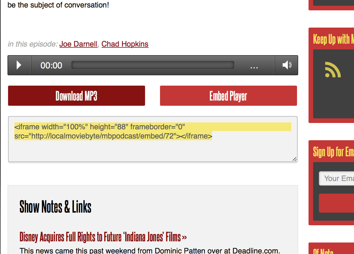
Podcast episode pages are completely new and have a new audio player. It is a much nicer player that is, of course, responsive. Show notes are more expansive. Each link in the show notes gets a description (this affects the last couple of shows, and shows going forward. Older shows will not have this because it’s a new feature I added to the CMS). And the player for each show can be embeded on your site. If you liked a particular episode and want to display it on your site, click the “Embed Player” button, copy the code, and paste it into a post on your own site!
Search has been completely replaced with a new third part add-on for ExpressionEngine that will provide far better results. Go ahead, give it a try. I think you will be pleasantly surprised.
That’s all I can think of for now. I expect this new design to carry the site even further than the first design did. It has personality, but it doesn’t get in the way. It looks good on all devices, and it was done with the entire featureset and scope of MovieByte already in place. I already knew what it needed to do, and so it does those things easily.
I hope you all enjoy it!