As you can see, I have just rolled out the second major redesign (or third version) of the MovieByte website. It represents several months of late nights listening to music, designing in Photoshop, and writing code like a mad-man — while still working my 40-hours-a-week day job and cranking out a podcast (almost) every week and keeping the site populated with content. I tell you all this so you can feel sorry for me.
I’m kidding, I loved doing it!
Previous Designs
The first iteration of the site when we initially launched in 2012 felt a bit heavy. Oh the site was plenty fast, but I mean in terms of the design aesthetic. It had a lot of shadows and texture. It was also not responsive and mobile friendly. I knew this was something that needed to be rectified.
In 2013, I worked on a responsive redesign and rolled it out late in the year (sort of like this year). It was a major improvement in several key ways, namely if felt lighter, I removed all textures, I made it mobile responsive so it would be friendly and easy to use on phones and tablets, and I made several technical improvements behind the scenes.
But that design didn’t sit well with me after a couple of months. I determined after some critical feedback and after considering it myself over a period of time that I would design something altogether different for the site.
3.0 Design Goals
I spent quite a while even just thinking about what I wanted for the site before I ever even opened Photoshop. What are the primary purposes of the website? I came up with two:
- A home for Movie Podcasts
- A place for writing and reviews
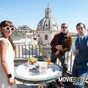
Number 1 is obvious because we have the primary podcast, The MovieByte Podcast, and we have Movieology (the guys tell me they are working on new episodes). I would like for there to be more podcasts associated with MovieByte in the future. So I needed to improve the podcast experience.
Number 2 is obvious because I do a lot of movie writing on MovieByte. In the future, I want to have more writers involved so I need to do a better job with readability.
So how have I accomplished the goals — at least in my opinion?
Podcasts
First of all, the three most recent podcasts from any show are promoted in the site header. Click on these takes straight to that episode. Plus the podcasts are listed in the site header. Right now that’s just two. In the future, when we have more podcasts, I envision them having more prominence in the menu.
Secondly, when you go to any show’s page, for instance, The MovieByte Podcast, The first thing you get two after the site header is info about the show — the artwork, the title, the description, the hosts, and how to subscribe or send us an email about the show. From there, you get a listing of the most recent epsiodes with their descriptions in a contained width space for easy reading.
The episode page, again reference the most recent episode of The MovieByte Podcast for an example, is much improved over the old experience. On the side you can see which show the episode is part of, who was on the show, and again how to subscribe and interact. The player, MP3 download button, and the embed button are all still present, if slightly redesigned and flatter looking. And the Show Links are easily accessible.
The Show Links have a new option. You’ll see a checkbox near the top where you can specify whether to open links in a new window (or tab), or not. I have to give credit where credit is due, and I admit this was not my idea. I got the idea from Dan Benjamin’s 5by5. You’ll see his show notes have the exact same option.
And of course, as always, there is a comment form for each episode which I hope you all will make more use of in the future. We would love to interact with all of you more.
Articles and Reviews
One thing I felt the previous design did not do well was emphasize readability. You will see, I think, that this was an upmost concern for this iteration of the design. In fact, the entire design is much more simple so as not to distract the reader. The sidebar full of distracting non-sense that wasn’t providing much value is gone. All written content has been centered on the page and width constrained to a comfortable reading width. In addition, while the font is still a very plain (and handsome, in my opinion) Helvetica Neue, I increased the font size slightly so that you’ll have no trouble reading content. I noticed on many occasions proof reading reviews that the font size was a tad uncomfortable.
Responsive and Retina Ready
Obviously, as with the previous design, this design is completely responsive for all devices. This is important in our modern age of smartphones and tablets. So it doesn’t matter what device you view MovieByte on, it’s going to look good and respond to your screen size so that you have a good experience.
By the same token, the site is completely retina friendly. All images are of sufficient pixel resolution so as to not pixilate on those ever more common high resolution screens. Since I currently have three devices in my possession that are running at 2x resolution — not the least of which is my primary computer, a Retina MacBook Pro — I understand the importance of this.
New Logo
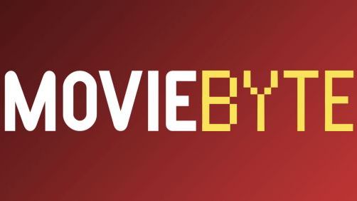
You can also see the updated branding logo. I loved the old logo in many ways. It was shiny and had those cool 3D swishes behind it. But it wasn’t really consistent with the branding look I wanted anymore. And I never felt like we took advantage of the name very well in the branding. Obviously a “byte” needs to look more digital, right? With that in mind, I asked Joe to come up with the new logo even before I started on the new website so that I could have something to build on. I think he did a killer job. I think it’s distincitve and memorable, and takes advantage of the idea of a “byte”.
Your Thoughts
I had some vocal critics of the previous redesign, and I’m sure I will again for this design. But that’s perfectly alright. If you have thoughts, be sure to leave a comment for me and let me know what you think. I’d love to hear any differing opinions or thoughtful analysis of the new design. Being critical is fine, just make sure to be nice.
And of course, if you love the new design, I’d obviously love for you to stroke my ego. So go ahead and do so in that comment form right below.
I look forward to writing content on this new design on Monday!